Wednesday 12 January 2011

Title Sequence - Final Touch


While Loanne was working on gathering every rendered file in After Effect to composite and put music on it, I made the title sequence. The main aspect of our city is paper and the paper plane was a good tour guide, so I made it with crayony writings of title and our name on the paper and flying paper plane. It suits perfect with our final video and I am so proud of our outcome. We all know we had dramas in the beginning and end. Especially between abs and I, we had a communication problem we solved out after a bit of argument and long conversation.  Fortunately I think both of us didn't take any words personally so it made the situation easy to solve.  I guess every team had bit of problem of theirs. We all do make a mistakes and we learn lesson from the mistakes, and we managed to make our city nicely in the end. Also I am happy for myself to managed scene 18 to 24 indipendantly. Well done, people!

Title Sequence


Tuesday 11 January 2011

Working on the last scene.

Now I need to finish the last scene which is scene 23 and 24. This scene is the very important scene throughout our video. The plane crosses in the end of scene 23, this shot is the turning point from the imaginary magical paper city to the real world room.


These scenes look very simple and easy to work on storyboard, but it was trickier than I thought it was going to be. In the scene 23 storyboard, the plane comes from far and fully cross the frame in the end. and city as a background should change to scene24's city, while the plane comes across the frame. Obviously for the continuity, the last shot of the city in 23 and the beginning shot of the city in 24 should be same scale, position and even similar intensity of illumination. I already set the camera in 24 for zooming out, so I set the 24's beginning shot as standard and worked on last camera position firstly in scene 23. Even though I wrote down the value of translate and scale of X,Y,Z and focal length of camera, the city's position was slightly different in each file. I only need the value of focal length and positioned 23's city and camera based on the first rendered image of scene 24. Before I rendered both scenes, I thought I can erase rest of the background bit later in After Effect when the plane is in the full frame. But I needed to erase it frame by frame, so I just rendered scene 23 and 24, and the frames of paper plane in scene 23 so I can composite in After Effect later.


Plan for switching scenes.


Voila, IT IS DONE NOW! I'm really happy it worked immediately! If we make fade out in the end in the final work, it will look simply nice.


Monday 10 January 2011

Camera, Composition, Animation.

I set up the camera work for Scene 24 couple days ago when I finished the texturing and lighting.
However I need whole city to shot the scene, I started to work on scene 18 to 21 because there is only my pinwheel Island in the shot. Also Abs cut off few scenes because there were too many scenes and it would exceed the 90 second time limit. Therefore now I need to work on scene 18,20,23 and 24. Scene 18 and 20, and 23 and 24 are connected scene each other, so I am going to start scene 18 and 20 first.


Scene 18

Scene 20


For the bridge, we were going to use Moses model, but his bridge looked too realistic, kind of Millenium Bridge style. We agreed to change the bridge to more like simple box shape. So I quickly made another bridge and textured it with newspaper.


I set the bridge with the pinwheel island, set the camera as well. To animate the papaer plane, I used CV curve tool as motion path instead of key framing. It made paper plane flies smoother.

At first, I planned the camera follows to the bridge a bit as plane crossing the frame , but Abs thought static camera would be nicer.  I preferred moving camera shot. Because this scene is turning point from the city to secret island and moving camera gives the sense of continuity and make audience to feel "now, we are going in to that island". Whereas, static camera shot is more like narrated by spectator's perspective. I rendered both of them and moving camera shot has voted for final.


Moving camera shot


Static camera shot
  

Continuously,  the plane flies in scene 20.

Tuesday 4 January 2011

Taking a break

 As I finished tree, abstract roof building, room interior and major pinwheel island, I officially finished my part and now I need to wait to move on until other member's work is done. It is already 4th January and out work speed is quiet left behind comparing to other groups, but I believe we can finish in time. I just worried about we have other projects going on as well. I almost finished other project which calls chopshop, so now I will focus on the composition for our scene 18 to 24.

I am the one who always put off all the work til the last time. However after the first year finished, I thought I shouldn't do that anymore and realised it isn't efficient either. So I decided not to delay things what I should do and keep up the plan. Although our team started work late because of the changing theme and stuff, I think I have been doing my job quiet well comparing to "the old me". I actually never thought I could throw out my old bad habit, but I am very happy I could keep the promise to myself!

Pinwheel island Pt.2

Now I finished the modeling one pinwheel and ready to texture it. But before I start to texture it, I wanted to do animate spinning the flags of pinwheel. I had a lecture about using expression in Alex's lesson. I really enjoyed the lecture because I used to study C++ programming and game programming in university in korea before I go to Ravensbourne. Also, over this summer holiday, I found MEL scripting and expression is familiar area to me and interesting. So I was going to try use simple expression for spinning the pinwheel. I think the best merit of using expression is i can control many objects by simple lines of programming language. Also it can be used very effectively on particles and dynamics.

So I played around few control lines to spinning pinwheel.


The expression lines in that picture is


Flags1.rotateZ = time*cos(time+100);
Flags2.rotateZ = time*cos(time+80);
Flags3.rotateZ = time*cos*time+70);


The Flags1 is the middle, 2 is left and 3 is right one. The middle one was the main pinwheel so I wanted to spin faster than other two.
The expression I wrote means : the flags' rotateZ value increases as the value of time multiplying by cos(time value+100 / 80 / 70).


Another try was


flags1.rotateZ = -time * 150 * sin(time*2);

flags2.rotateZ = flags3.rotateZ = -(time*100);


which means : flags1's rotateZ value increases by time and 150times faster and its spinning way is decided by sin(time*2) value.

As I used cos and sin function in the line, it was spinning left and right as the value of cos graph goes to + and -.


After Playing around with expression in many different ways,  I made it proper pinwheel island.  
I textured it as well. I wanted the pinwheel spins faster as time goes by. 

So the expression was

flags1.rotateZ = time*(time+100);

I multiplied (time+100) because it need to get faster. 


The result is :


The outcome is exactly what I wanted. I really liked using expression, reminding old days and I have been thinking studying MEL scripting and expressions really seriously. As soon as this project finishes, I will start up studying MEL and expressions!

card pyramid

When I made the city simulation in maya before, I finished the card pyramid. I thought I did but when I tried to texture it, I found the major problem of the pyramid. I made it with plane, so it had only one face normal which means it can only have one side to texture it. Although I could see the texture from back side of the face normal, it just means that i can see through the front face's texture. One piece of paper has front, back and very very thin side bit but I guess i ignored that. So I made it again and also found amazing card textures. Not like the ordinary cards, they looks something different and simple. For me, simplicity and unique design is the key theme to choose good design, so I used some of them on my card.


Penguin as a joker? it doesn't sound good role for penguin but it is fresh.


source from : http://a_pollett.tripod.com/cards41.htm


Textured pyramid


Now It has been textured on front, side and back of each cards!


Sunday 2 January 2011

Museum exterior

I am currently making pinwheel island for our project and the last scene of our video will finish according to my story board (below). Basically the scene explains our paper city is actually maquette on the table of museum. Therefore I took the job of making the exterior of museum/gallery.


Modeling the room and props were not tricky but it should much more focus on the maquette on table so lighting is the key theme for this room. The spot light was essential because it gives focused feeling as itself and I played around many lights for room itself.


This is the plain room I made without any lighting.


spotlight

This is the rendered image of the room with spot light only. It is dark because there is not any other supportive light. Plus, room and props were not textured yet at this time.


spotlight + 1 point light

This images shows work flow with one spotlight and one point light. Point light emits light from one point so I thought it would play as light bulb. It certainly lightened the room but it looked weird because I couldn't see the shadow under the table and ramp's shadow on the wall.


spolight + 1 point light + 1 directional light

So I added another light which was directional light on the corner of the table to make the table's shadow. Although the table looks much brighter and has two layered shadow underneath, however, this directional light made lamp's shadow on the wall in a weird way which i didn't expect. Afterward, I REALLY struggled with this directional light and others like volume light and ambient light for the right shadow, but all didn't work as I wanted.

spotlight + 2 point light

So I just added another point light near the table, and it was just right shadow i thought. I was little bit worried it looked too soft and smooth but props has not connected to right material and texture, so I tried to stick to this lighting combination and textured them first.


spotlight + point light (black shadow colour)

spotlihgt + point light (brown shadow colour)

 The first picture above has white as light colour and black as shadow colour so it looked a bit artificial to me. Room was too bright and shadows are too dark. So I dimmed the light colour as light brown and brightened the shadow colour as brown. It turned out the atmosphere of the room itself looks much more focused on the table but table shadow got too lighten. I still needed the final touch. I re-checked the shadow options of spotlight and made shadow link with spotlight and table. 


Finally, the table has two shadow, the bigger one is from the spotlight right on the table and the smaller one is from the room light on the ceiling. 

Overall, modeling and texturing were very simple job but lighting was very tricky and even slight colour change gives so much different mood. I assume that trickiness makes lighting as either burden or interesting work.  I reckon it will need more lights when our paper maquette is on the table, I will be happy to work on lighting again.


Abstract roof

After I found below origami style paper work, I thought this one would look super cool as a top roof of building when we shot bird eye view of the paper city. So I started to model it.


Paper Architecture by Prof. Yoshinobu Miyamoto


I thought it looked simple so it would not very difficult to model it, however, it turned out it was not very easy to make it.  At first I tried to make it with CV curve tool but it has depth and kind of spiral shape  so CV curve was not suitable. 
Then I made a poly plane subdivide 20x20 and made part 1 (below) first modifying vertexes. It was better than making with curve tool so I stuck to make plane and rearrange vertexes. Also I found the shape of part 1 and 2 is same as other side, so I decided to make 1+2 and duplicate them and combine them together. It was tricky when I made its depth because the photo shows only top of the objectbut i could manage to do it.


After I finished the roof shape, I made the building walls and textured them with some window drawings. I didn't want to make windows as real window but wanted to give some feelings of prettiness. So I searched some rococo style windows and found this picture.Unlike other flashy windows, I liked it has limited decoration around the window. As my building already has the abstract top roof, I thought these moderate decorated window would look simple but pretty.


After texture the building, below images are rendered. 


It looks like it's made with smooth but not coated paper which i like. It looks not very special on the side of the building but with the abstract roof, it certainly shows the building is not as same as ordinary buildings.


Tree

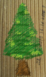
As Abs passed modeling tree to me, I worked on tree but much simpler shape. Also when i was in the college library, I found this crossed cardboard on the table. Immediately it came to my mind that this would be nice reference for the tree in our project. 


cardboard tree from google image


For texturing the tree, i decided to use cardboard image and drawings on photoshop. 
I used the custom brush which can give crayon feeling on cardboard.


After texture it, below images are rendered 3d tree.


Modeling tree was not very difficult job and I could finish it quickly.

Texturing also easy and I could find a way to make custom brush so it was fresh.
I can't wait to see those trees making harmony with other buildings in the paper city.